
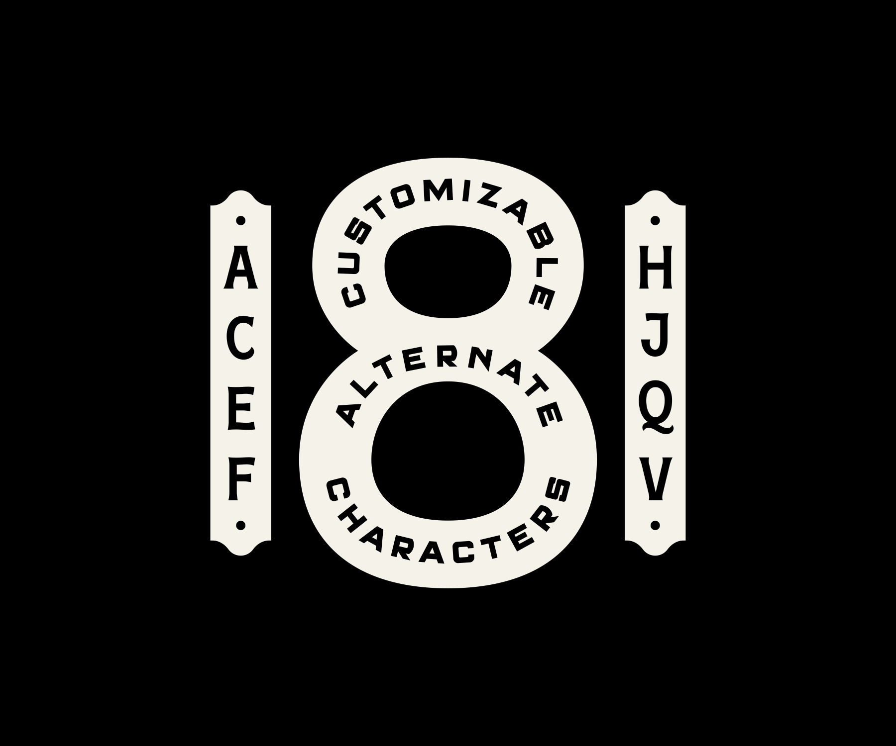
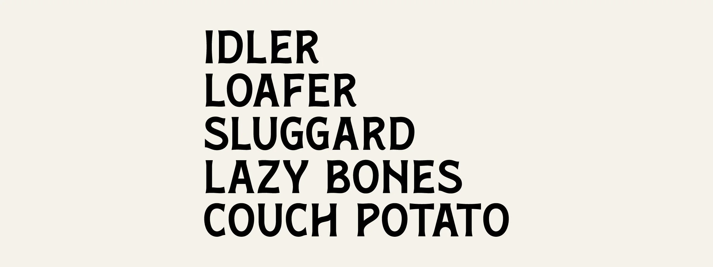
Slacker Typeface
Type Design
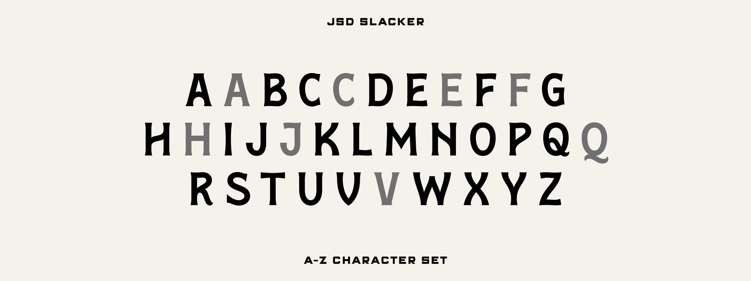
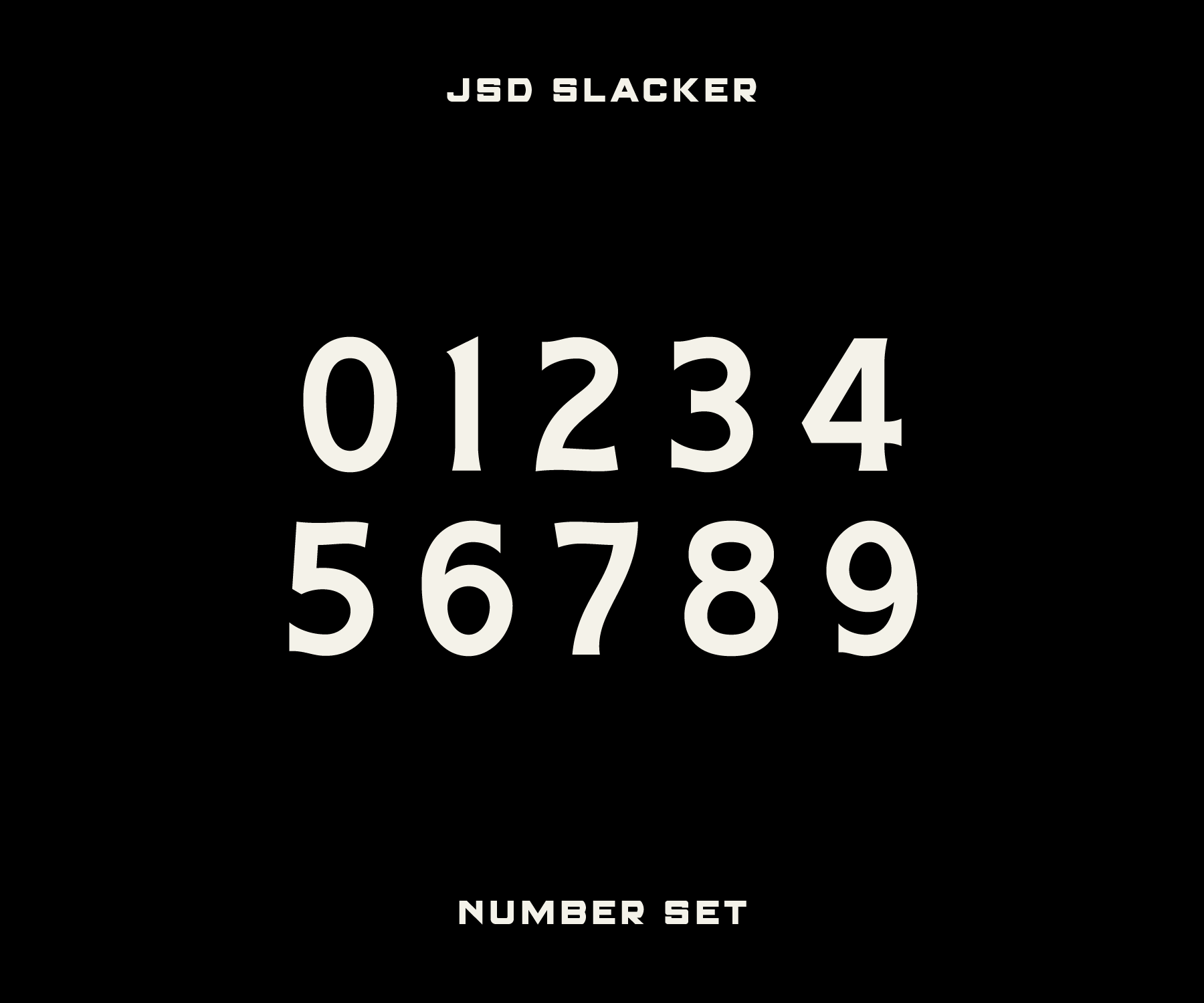
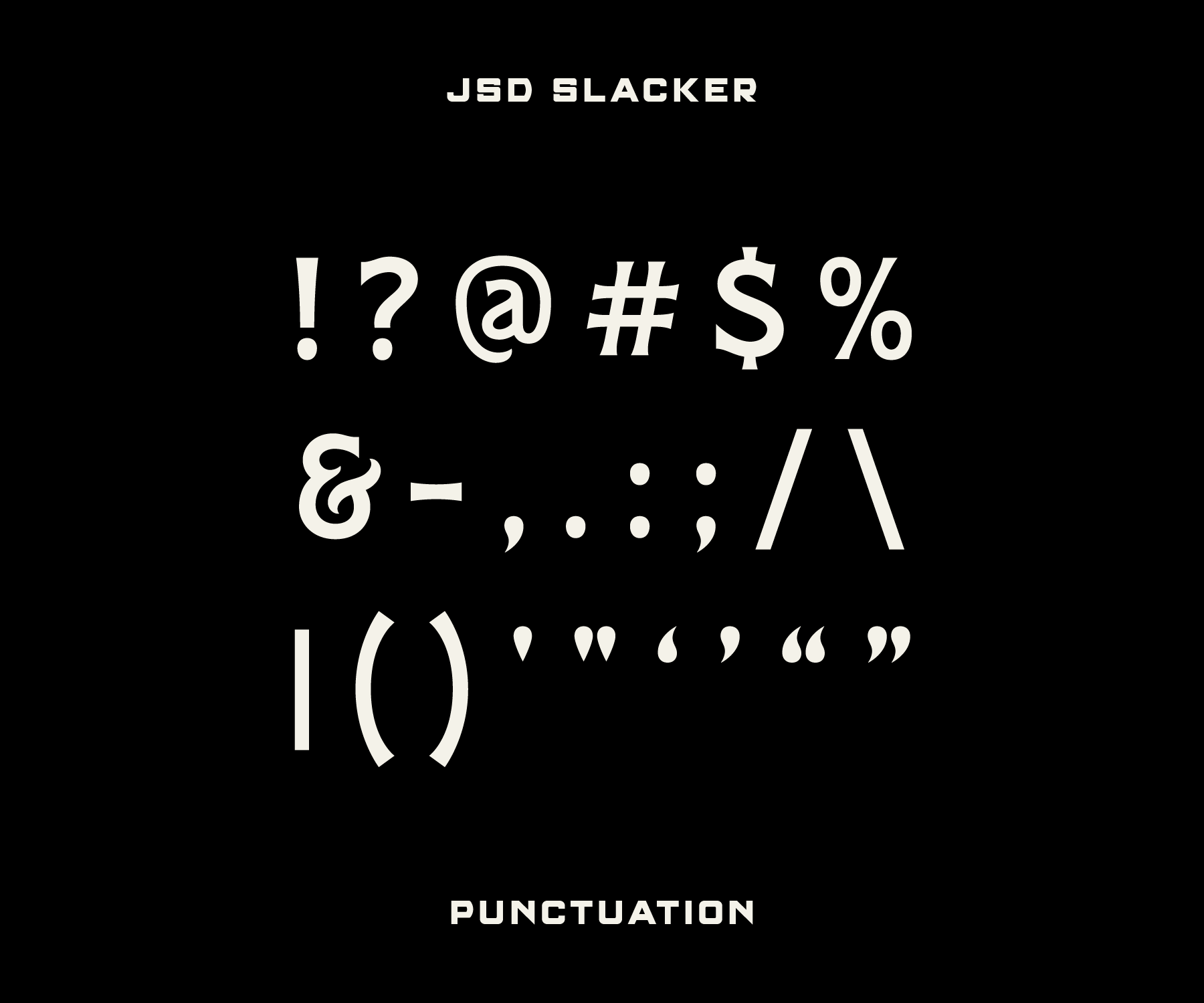
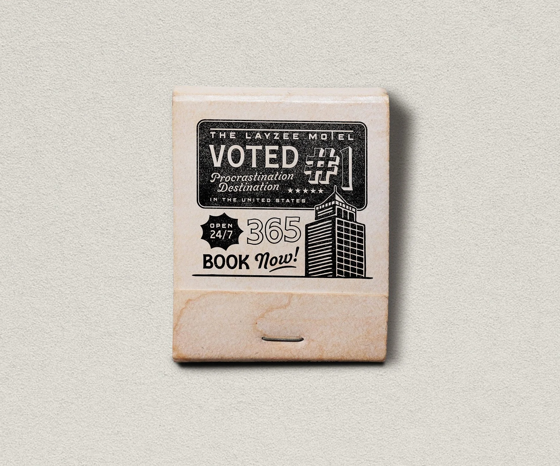
After being a work-in-progress for nearly three years, my latest typeface has finally reached the finish line. Named in honor of the incredible level of procrastination involved in its making, Slacker features an all-caps character set with flared serifs and wavy letterforms that are inspired by vintage coffee tins and packaging. I may have put this little guy on the back burner a few too many times, but it was built through hours of tedious work and is finally ready to see the world.

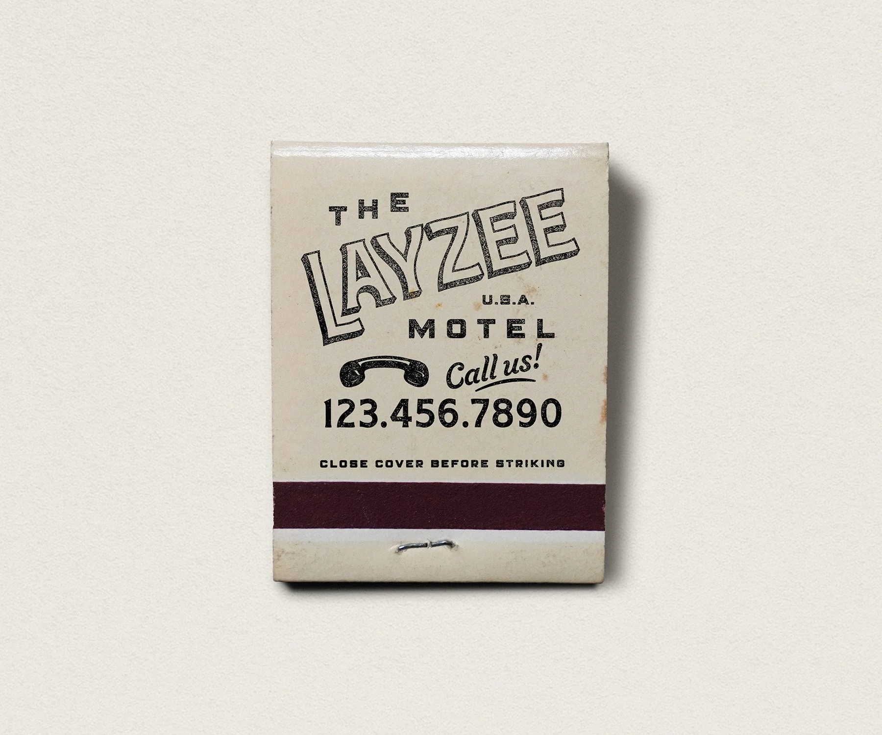
My goal when designing the letterforms was to create shapes that are unique but not overly quirky. When letters are too experimental, it greatly impacts not only the legibility and appeal of the typeface, but its usage as well. I wanted Slacker to be a typeface that anyone could reach for to give their project some extra flair while keeping things tasteful. Timeless always beats trendy.
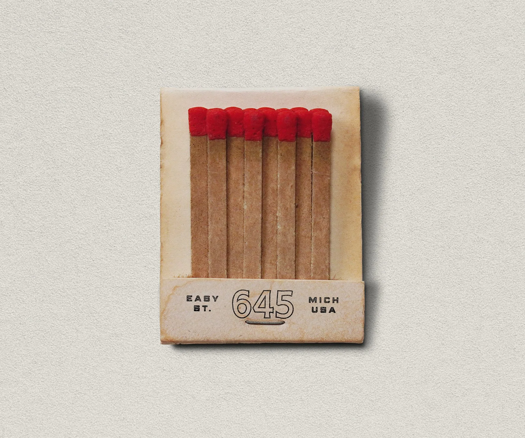
The bold, all-caps design with additional alternate characters makes Slacker an excellent choice for large headlines, packaging, and unique logotype. It pairs well with many different font styles and offers a wide range of versatility.
Unlimited personal and commercial usage. Enjoy!