Mount Olympus Travel
Brand Identity
With a passion for travel, Amy and Ben Klepser set out on a new venture with one goal: To inspire meaningful travel through thoughtfully curated journeys that broaden perspectives, celebrate culture, and create lasting memories. With a clear vision in mind, we set out to create a brand identity that would encourage anyone to take the leap and start planning their dream vacation.


We set out to create a sleek, no-frills logomark that displays trust and professionalism. Something that looks sturdy, a mark that couldn’t even be destroyed by sandblasting. When you come to Leone’s for protective coatings, you can bet you’re getting the best.
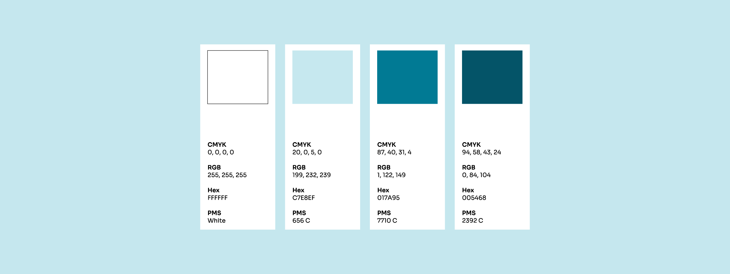
A poor color palette can make or break even the best logos, so we intentionally avoided flashy colors to let the logomark shine and match its simplicity. We decided on a trustworthy palette of blues and also sprinkled in some green as a nod to the beautiful hues of Lake Michigan.
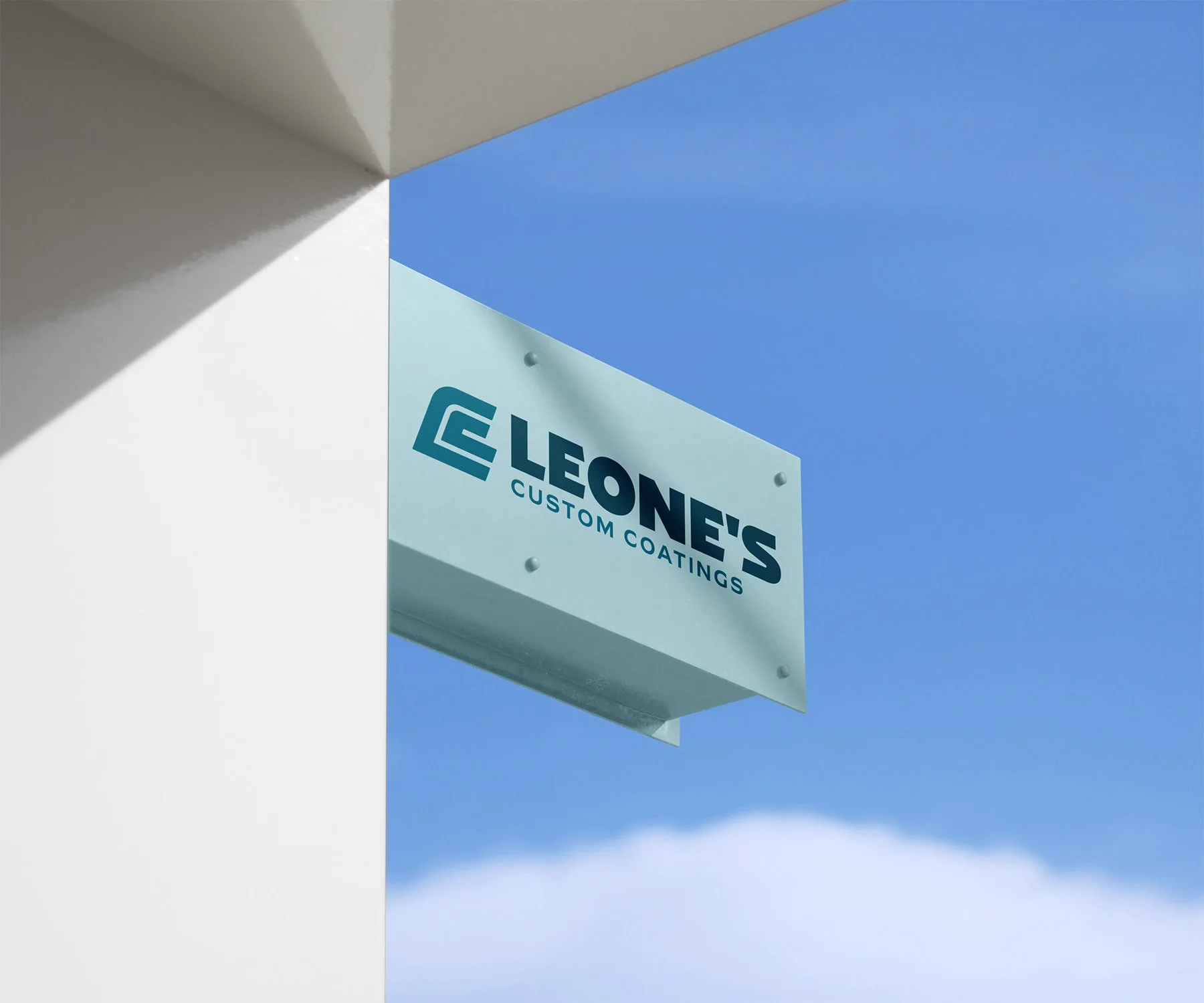


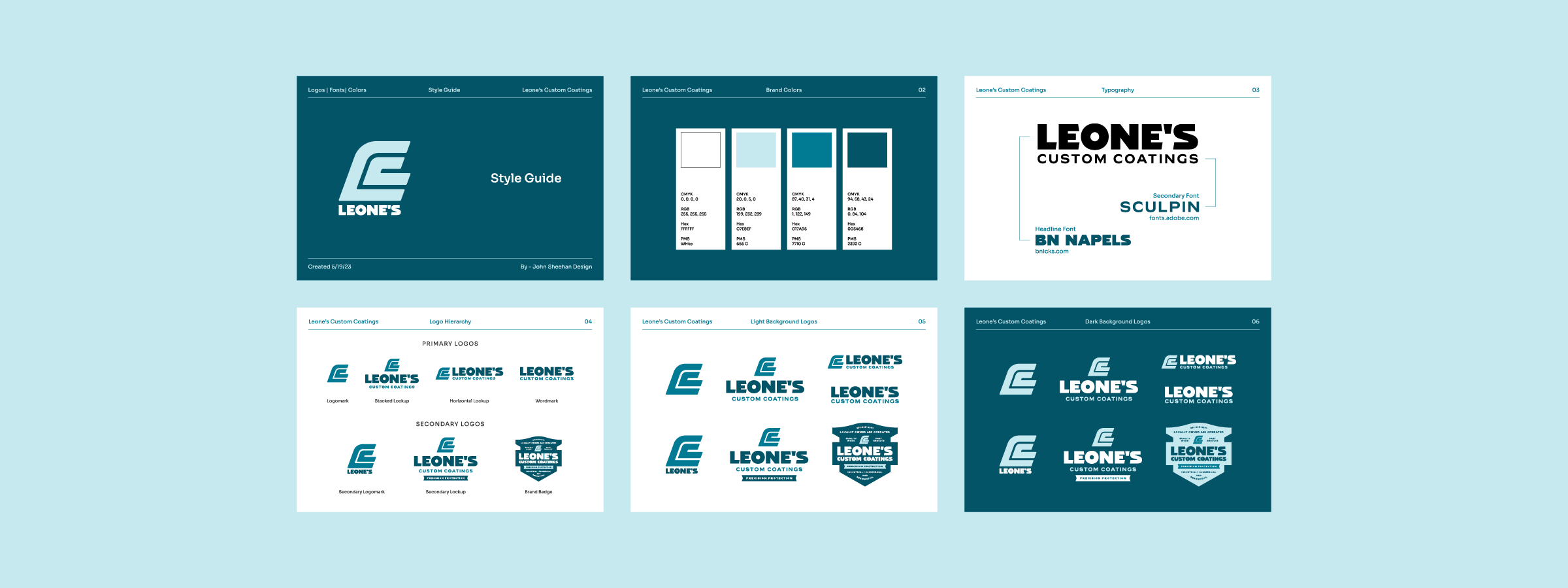
The logo package was rounded out after creating multiple lockups, wordmarks, and secondary logos that are ready to use for any application. A simple style guide was also created to help provide basic information about the logos, colors, and usage.