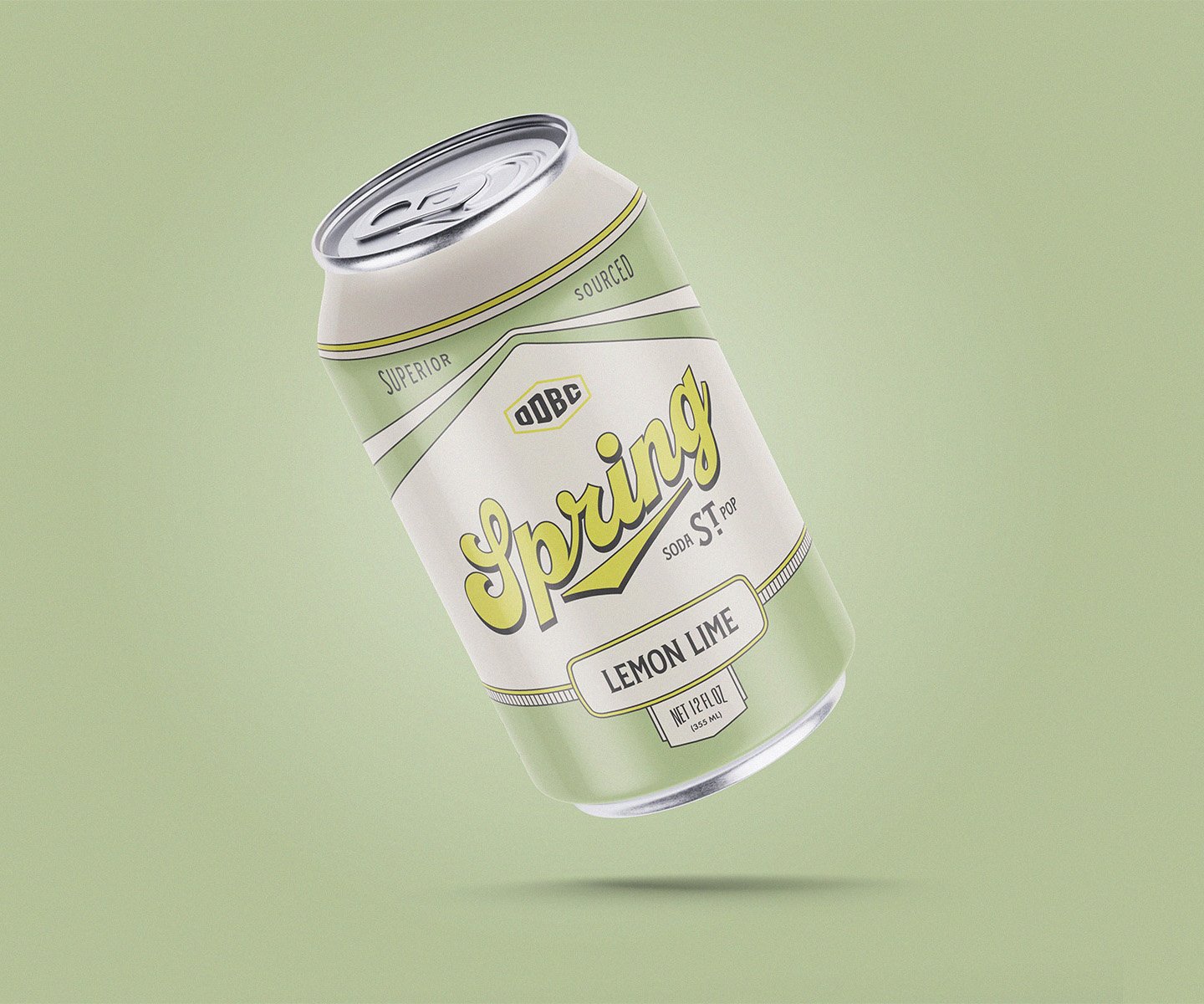
Spring St. Soda Pop
Packaging
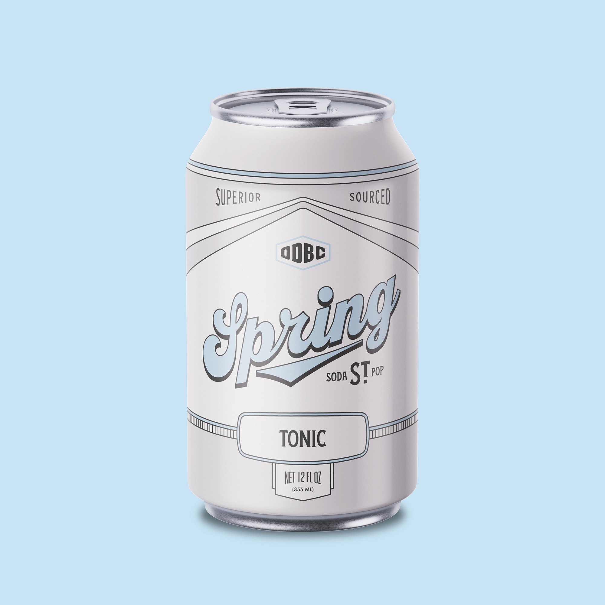
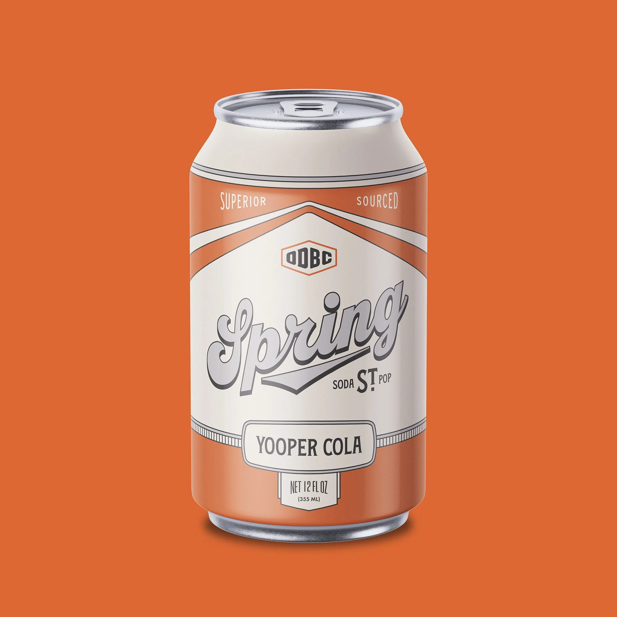
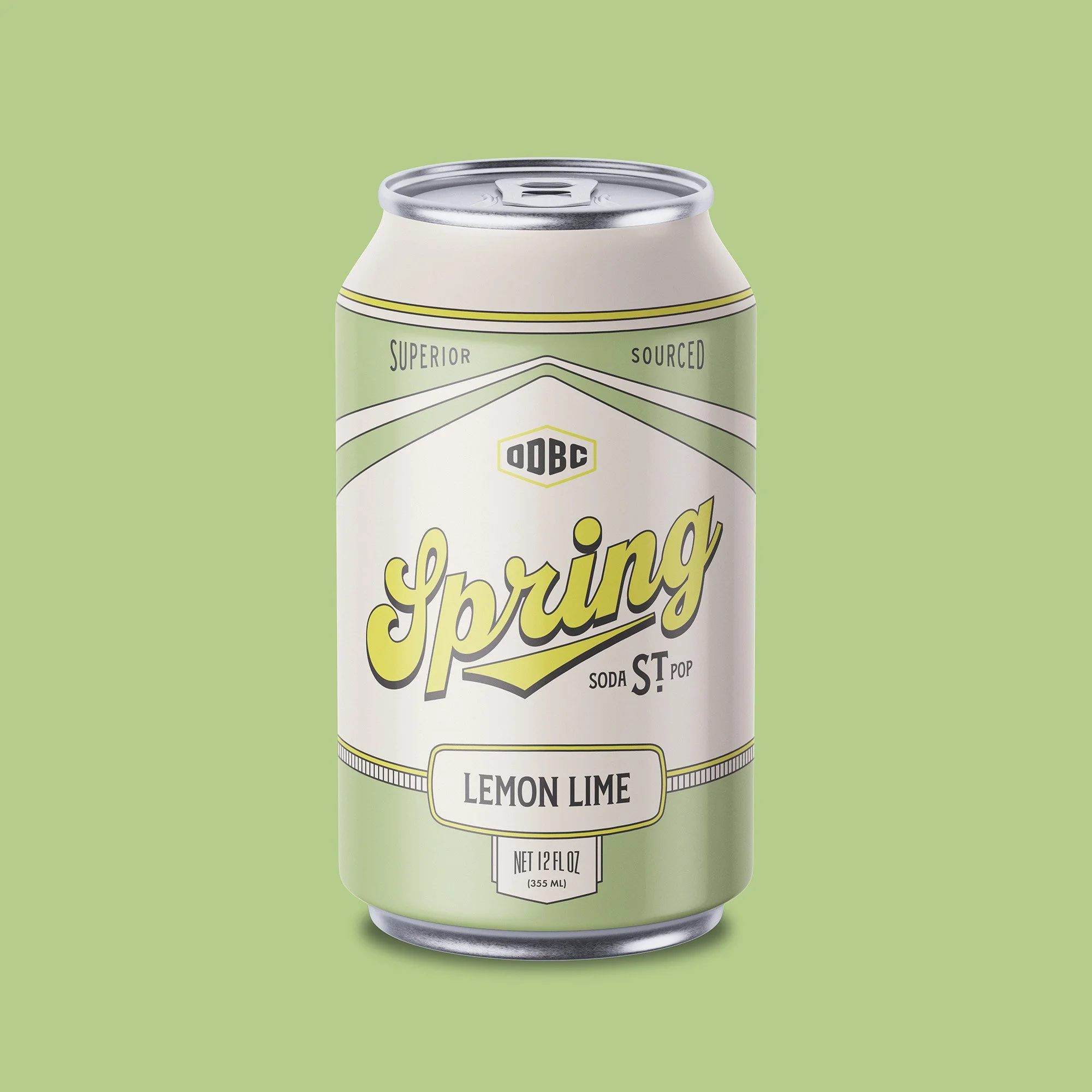
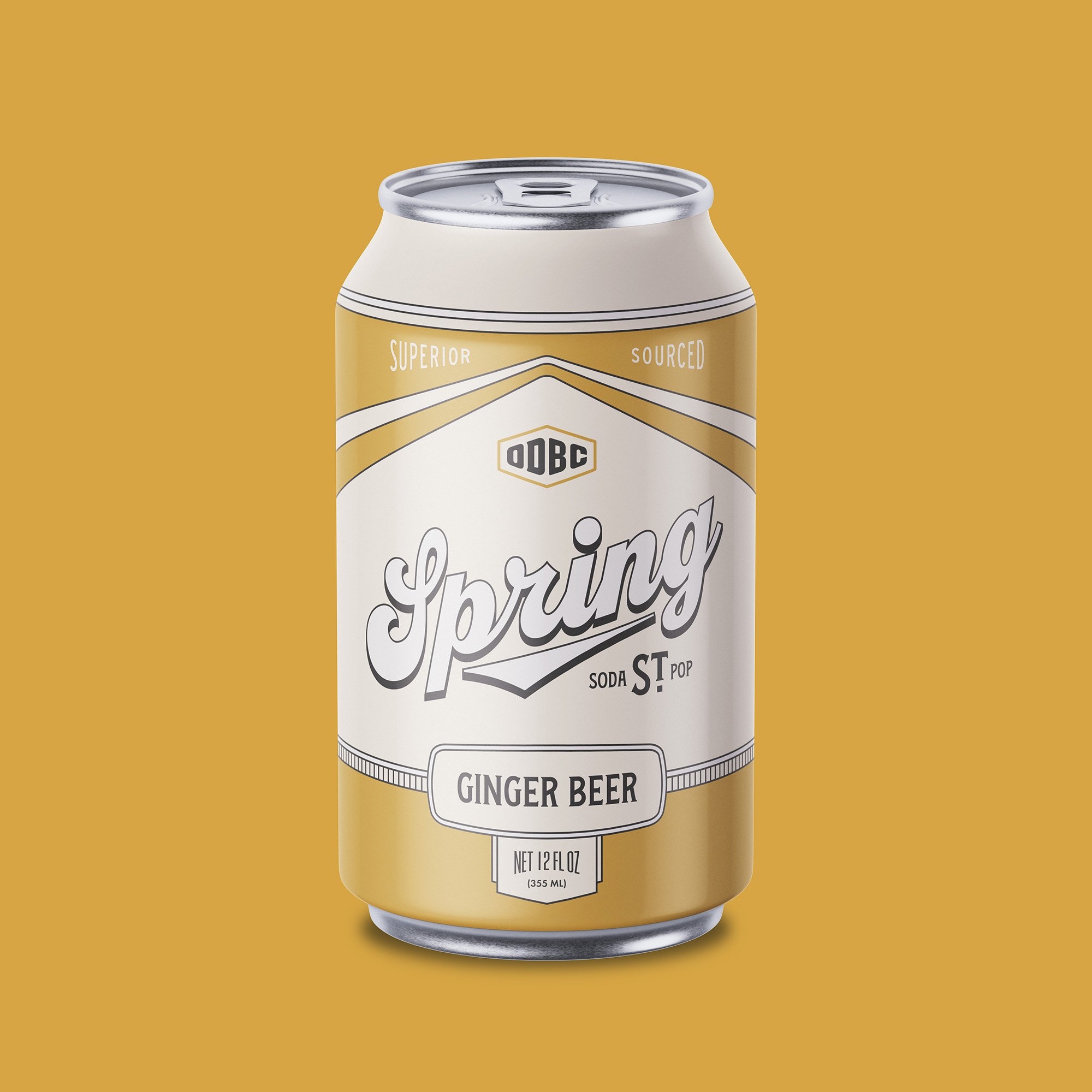
Spring St. Soda Pop is the latest line of beverages in the Ore Dock Brewing Company arsenal. Taking their slogan “Superior Sourced” to heart, this line of soda pop gets them closer to their goal of exclusively serving beverages made with the cold, crisp water of Lake Superior. With a launch this exciting, they were eager to get some brand new packaging that stands out on the shelf and also calls back to the company’s history.

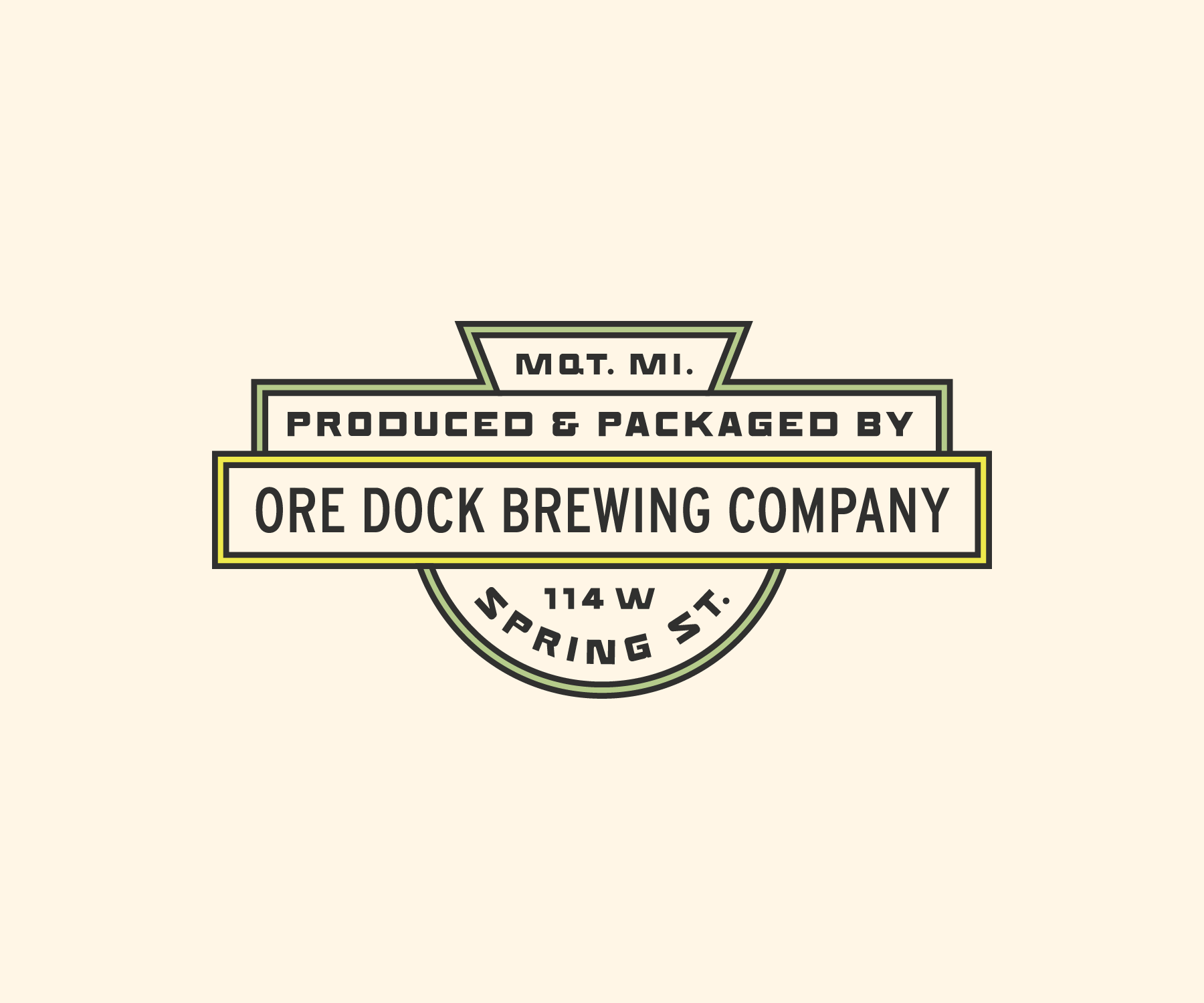
The building where Ore Dock Brewing Company resides has been around for over a century and has housed several businesses in its time. Before it was a brewery, it was a garage where cars were bought, sold, and serviced for nearly 100 years. To honor the building’s heritage, we drew inspiration from old oil cans, paying close attention to the unique typography, colors, and layouts.
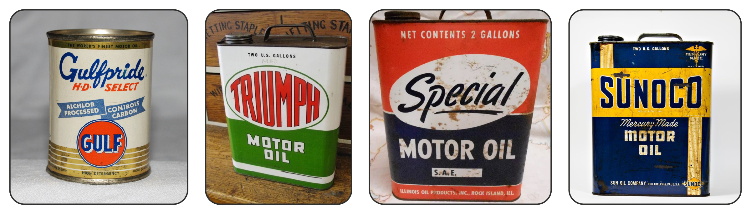
The final design relies heavily on the layout and stylization of the typography, as well as the simple yet dynamic line work that draws the viewer’s eyes from the center of the can all the way to the back. Many of the vintage cans we looked at for inspiration took a similar approach, using simple, functional design rather than overly-detailed graphic elements and illustrations.
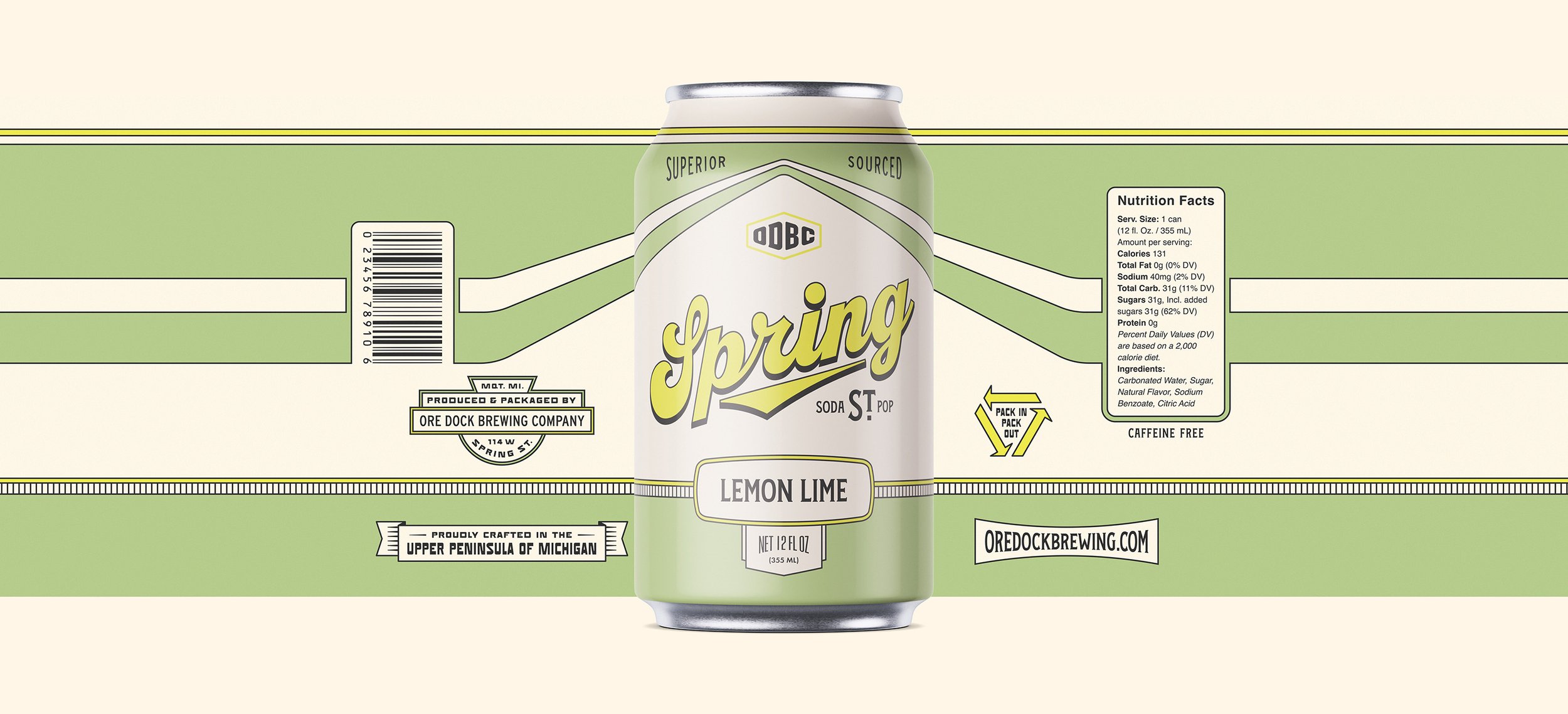
Spring St. Soda Pop would be releasing in multiple flavors, so a variety of labels were developed utilizing the same layout with varying color schemes. This ensured consistency between each label while simultaneously differentiating each flavor.